NTWICA? What’s that? An American assocation for nitwits? Close, but no. It’s an acronym for a term that I just made up: Now That’s What I Call Art!
NTWICA #1: Dragon Walker!
Beauty (and art!) is in the eye of the beholder and a lot of what I find visually pleasing today has its origin in artwork and design that was featured on toy packaging in the 1980’s, a time when I grew up and a time which will officially go down in history as the coolest decennium to grow up in for anyone EVER. Toy packaging from that era is some of the most beautiful packaging ever created. No really, I’m not biased :-) One of the reasons why toys from the 1980’s (and to some extent also toys from the 1970’s) had such cool packaging was not only because of the cool design of that era, but also because of the absolutely amazing artwork that was created for these toys. Something that is sorely missing from most toys today if you ask me!
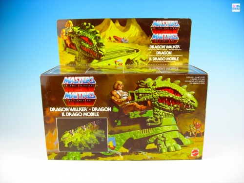
Masters of the Universe – Dragon Walker (1985) Mattel / Europe
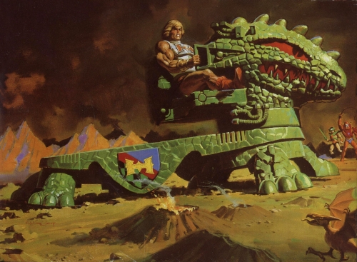
While most of the major toy lines from the 1980’s certainly had packaging that was endowed with beautiful artwork, to me there is one toy line that stands head and shoulders above everything else. That toy line was the Masters of the Universe…. Words can only say so much. Take a look at this (and click on the photo for a larger version):
Dragon Walker artwork
Damn, I remember seeing this artwork on the Dragon Walker packaging for the first time in my local toy store somewhere around start of school in 1985, which must have been late August or early September. I was ten years old back then and I was blown away by the sight of all the boxed Masters of the Universe toys and the Dragon Walker is one I remember the most of all. I can still recall the sense of wonder and awe that I felt as kid back then, whenever I see this artwork today. Quite amazing, when I think about it.
Even more amazing is the fact that we live in a time where so much of what makes up our childhood memories has been preserved both physically and digitally, which allows us to relive our childhood joys and examine things in greater detail than we were able to when we were kids. Case in point being a lot of the Masters of the Universe box artwork, which can be found online on several websites in nice and high resolution. There’s just so much beautiful detail to behold and today I would just like to share some of those beautiful details!
“Coat of Arms”
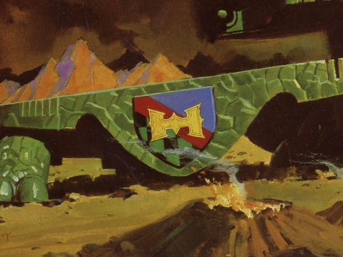
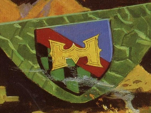
One of my favourite details about the Dragon Walker artwork is something that is not immediately apparent when you first look at the painting, but is something that does register on a subconscious level and adds to the sense of realism of this painting. Check the close up below. Right behind one of the smouldering craters, on the side of the Dragon Walker, we find what looks like a coat of arms!
Dragon Walker – Coat of Arms
I was fascinated by the design of this coat of arms. I never realised it was present on the actual toy itself as well. It shows blue in the upper right portion, which I guess could represent sky or water. Then there’s a black and green checkered portion on the bottom left, which I somehow believe to be related to the dragon itself. I guess it most reminds me of the dragon’s hide. Both portions are seperated by a red diagonal line, which is the colour of the dragon’s fire or his tongue. On top of that there’s a stylized letter “H”, which of course stands for He-Man!
Dragon Walker – Coat of Arms
“He-Man”
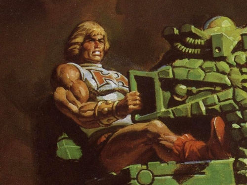
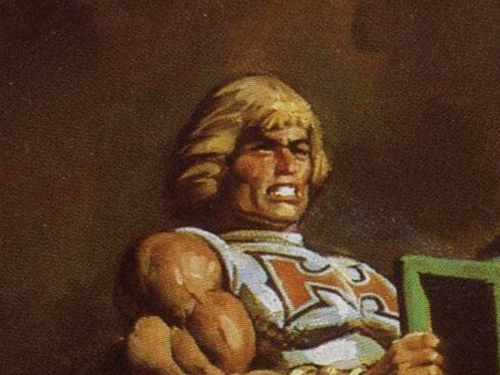
Talking about He-Man, here’s a close up of our hero himself riding the Dragon Walker. If you look closely you can see that same stylized letter “H” on his battle armour. He-Man looks just positively bad.. ass.. in this painting. Awesome!
Dragon Walker – Battle Armor He-Man
Now, He-Man does not particularly have the most manly hair cut there is. Truth be told. However, somehow the incredibly talented artist who made this painting (his name is William George by the way, remember that name) succeeded in making He-Man look like the baddest mofo on the block. Check those biceps!
Dragon Walker – Battle Armor He-Man: bad ass!
“Baby Dragon”
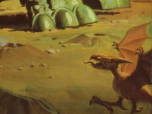
Another little detail that I would like to draw your attention to can be found at the bottom right of this painting. Here we find a little baby dragon waving his wings angrily at the Dragon Walker. This part of the painting is obscured on the front of the Dragon Walker packaging. It can only be seen at the bottom of the box.
Dragon Walker – Baby Dragon
“The Dragon’s Head”
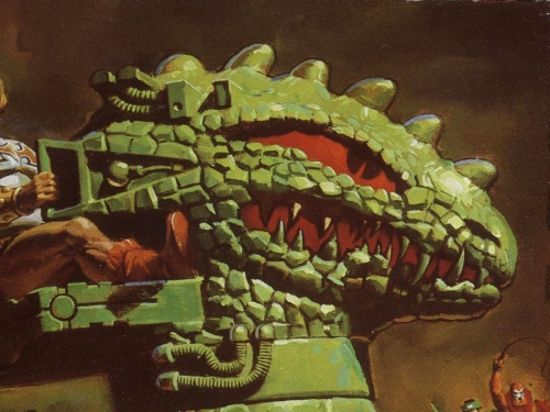
The next portion of this painting that I would like to direct your attention to is the head of the Dragon Walker. I mean, get a load of this:
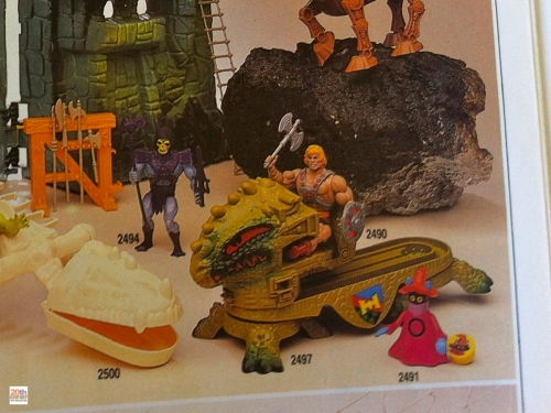
AaaRgH! By the power of Greyskull, how cool is this! (Note to self: say “By the Power of Greyskull” more often when I see something cool) Granted, the artist had the toy to go by, but man, what a fantastic translation from toy to mythical, fire-and-brimstone vibe dragon! *bows head in awe* (Note to self: this would look awesome on a poster…. ) For comparison purposes, here’s a photo of the toy itself from a 1985 French toy catalog:
Dragon Walker – Noël 1985 catalog
Cool looking toy? Hell yizzeah!
“Beast Man and Tri-Klops”
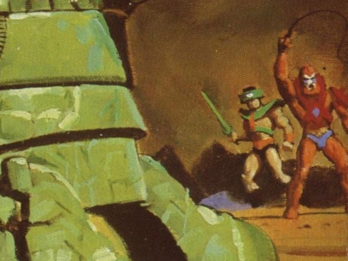
Finally, as is often the case with Masters of the Universe artwork we can find some characters in the background. Here’s a close up of Tri-Klops and Beast Man standing in the distance, both looking very defiant. Tri-Klops is holding his sword and Beast Man is lashing his whip in the air. Awesome! How can you not be impressed with something as cool as this as a young kid?
Dragon Walker – Tri-Klops and Beast Man
Thank you for joining me in this short look at what will hopefully be the first in a long line of “NTWICA” posts. The 1980’s live on! ;-)


